Fresh Focus

About Fresh Focus

Fresh Focus is a project I did as a preview of the final exam. The goal of the assignment was to develop a trade fair concept with a clear and distinctive style. I chose the theme of Y2K music, based on well-known hits from the 2000s. For this project, I developed the complete visual identity, including the logo, a brochure, a business card, a photo series, and a promotional video.

Logo & Card

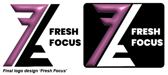
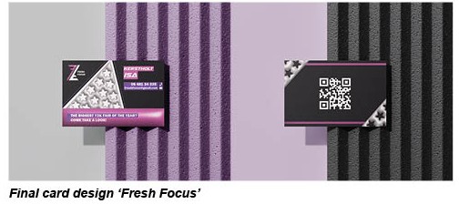
For the logo, I first created several concepts before selecting the final design. I chose the logo you see above. It is built from the initials of “Fresh Focus” and features shiny, inflated effects, inspired by the style that was very popular in the 2000s. For the business card, I wanted to give it a modern look by adding a QR code, while also incorporating the same inflated effects to maintain consistency. I also included a recurring star pattern as a visual element throughout the design.

Photo & Video

For this video, I chose a strong and clear concept that tells the story within one minute. To create consistency, I used the same models as in my photos. I selected Wannabe by the Spice Girls because it fits the theme perfectly and is instantly recognizable. I removed the original audio from the footage and replaced it with sound effects to keep the focus fully on the visuals. Throughout the video, I used animations, fully animating the lyrics to emphasize the musical theme. To add humor, I had two tough-looking boys enthusiastically sing along to the song. The message was that no matter what gender you are, music connects!


Upside Down

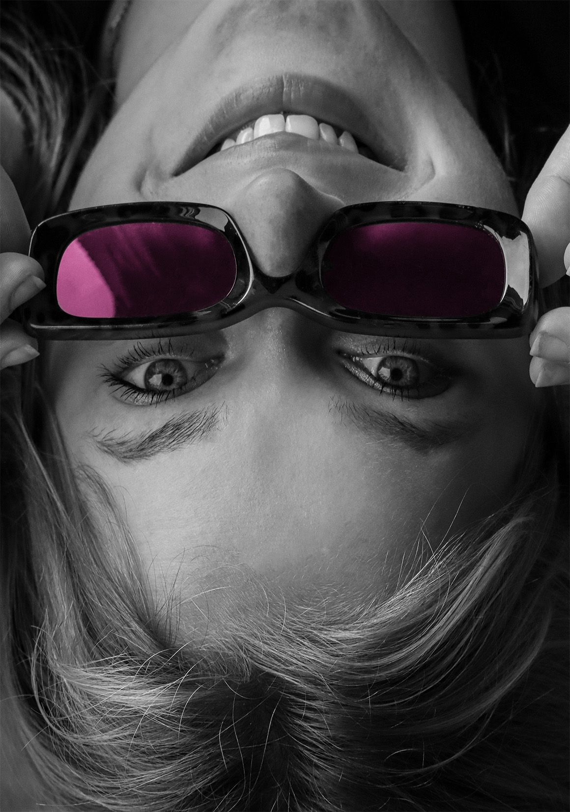
A close-up portrait photographed upside down. The image is black and white, with only the pink lenses of the sunglasses in color. This effect was created using selective color editing.
IMG_99152IMV3B_ISA KERSTHOLT_FOTO 2

Youth

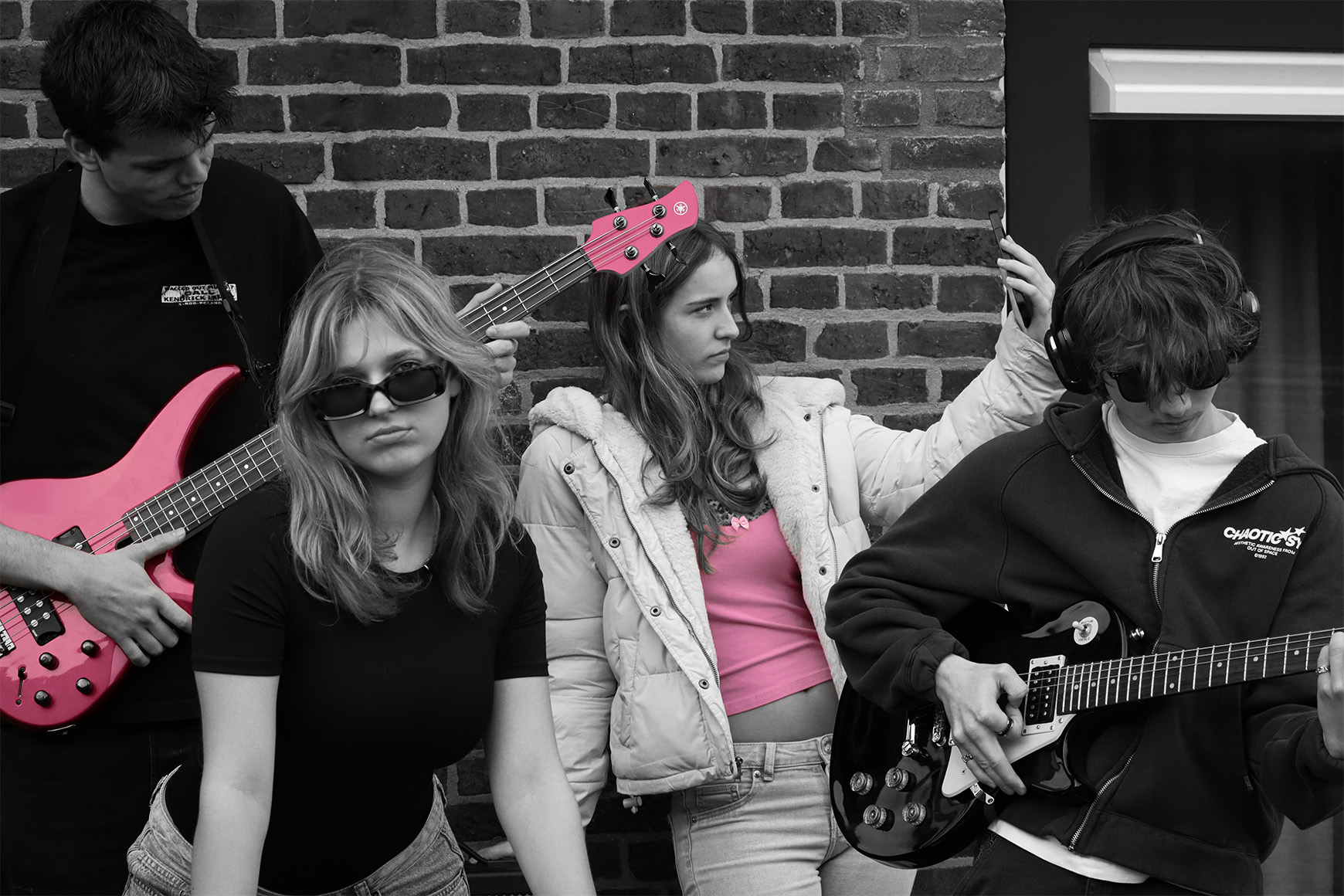
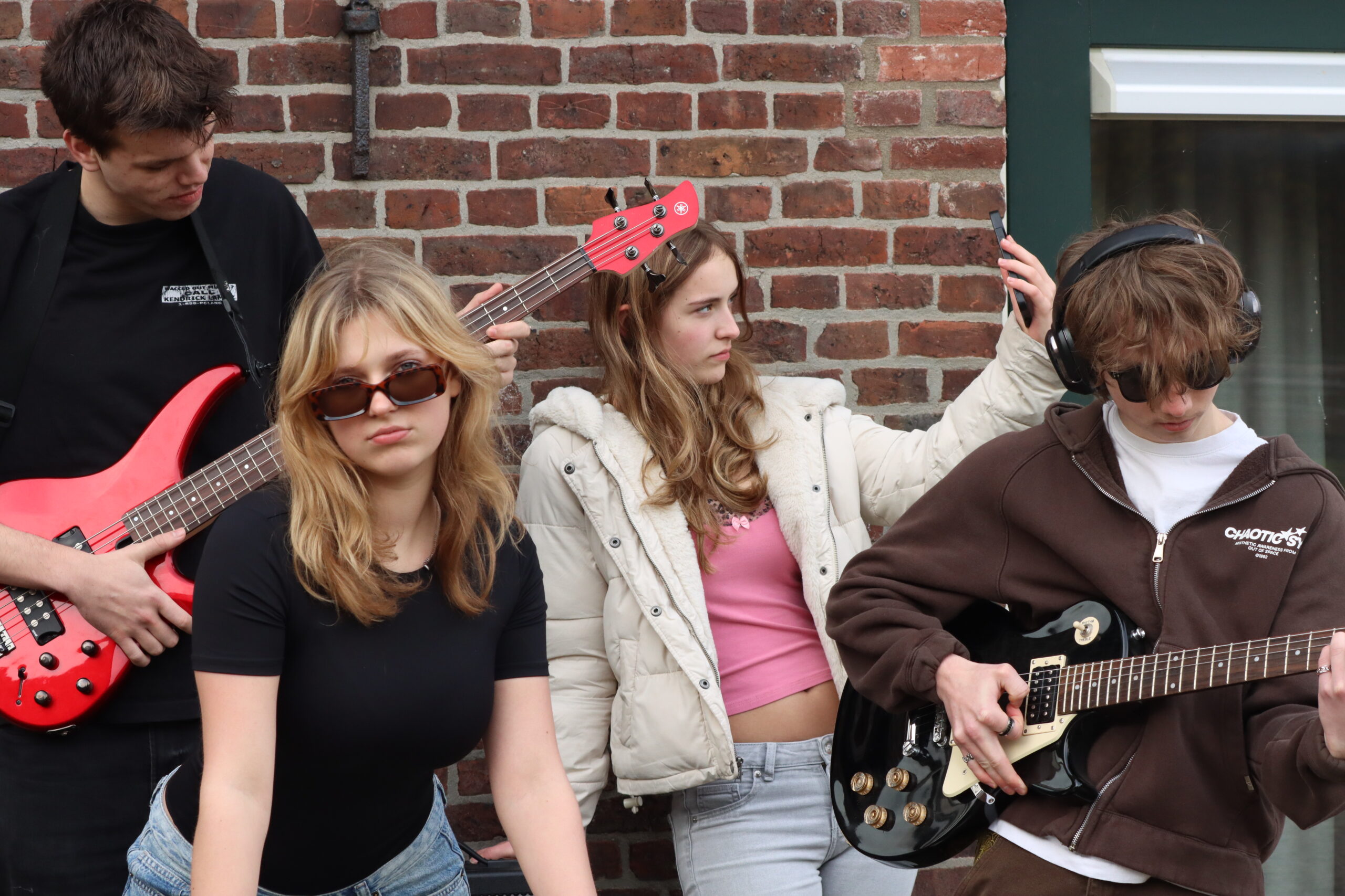
This is the main image and shows a group of teenagers with musical instruments standing in front of a brick wall. The composition places them close together, creating a strong band-like atmosphere and sense of unity. The photo is mostly black and white, with pink accents on the guitars and some clothing details, which immediately draw attention and create a consistent visual style. The brick wall adds texture and an urban feel to the image. It was likely taken using natural light and later edited with selective color to emphasize the pink elements and give the photo a bold, modern look.

Jam Session

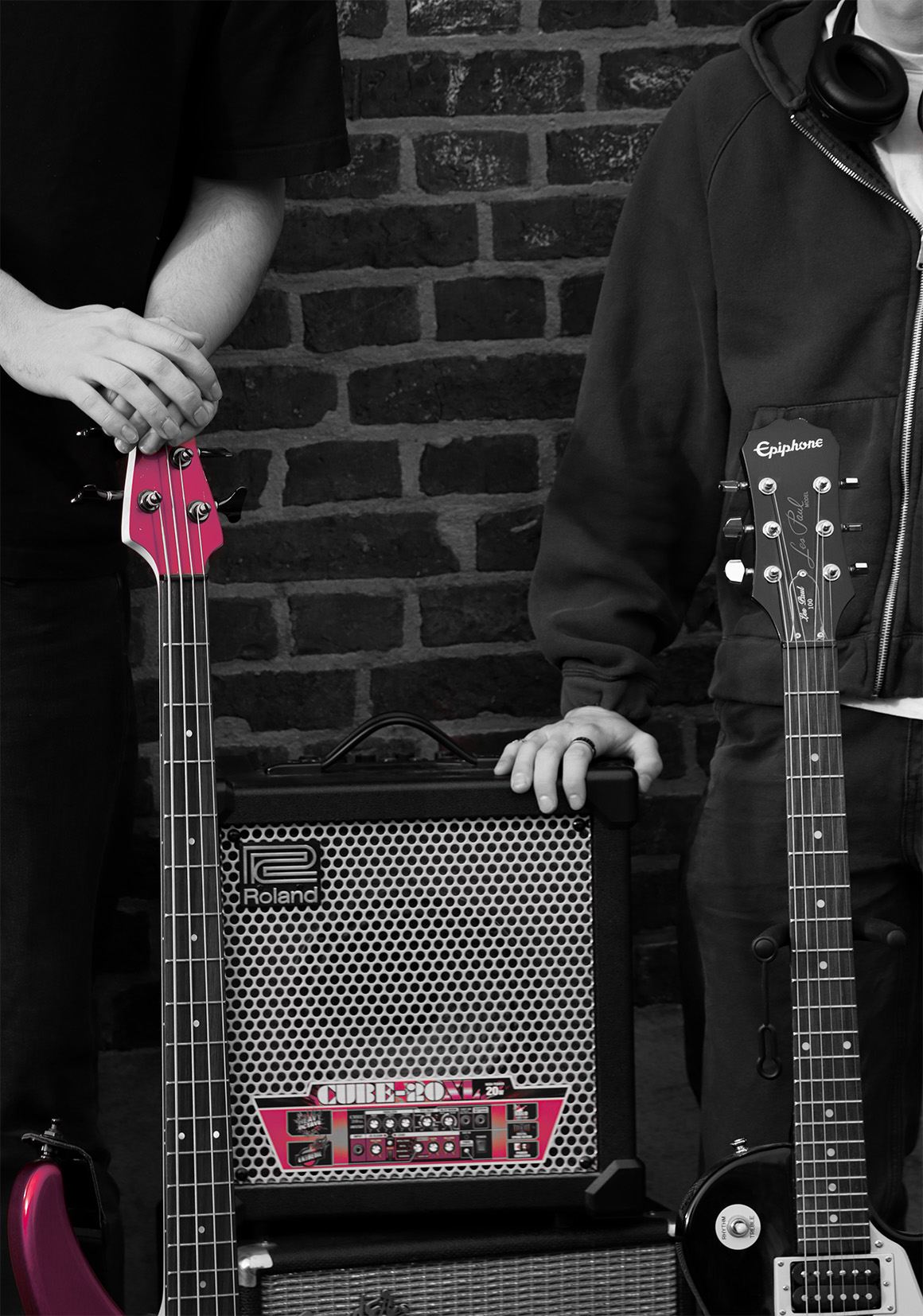
A detail shot of guitars and an amplifier. The image is black and white with pink accents. The focus is on the instruments, enhanced by selective color in post-processing.
FRESH FOCUS 2.0

Trifold

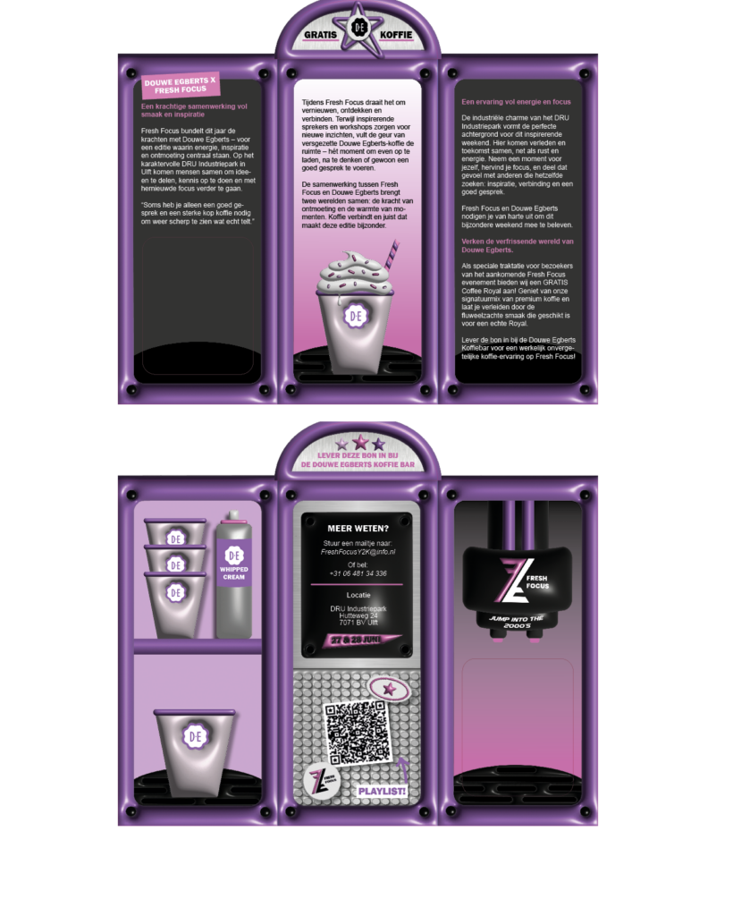
Eventually, we got to work further into our exams with the same theme. So the concept of Fresh Focus became our exam, in which we had to work further. In the exam we had to choose a company to do a fake collaboration with. We could choose between Pickwich or Douwe Egberts. Tea & coffee brands. I chose Douwe Egberts, and for this collaboration we had to design a special folder to promote the brand. My idea was to make a folder in the exact shape of a coffeemaker. I used the general style of my past work for Fresh Focus, to make it fit in the big picutre. At the top of the folder, you can find a coupon. You can rip the coupon off, because of a perforation line, and use it to get a free cup of coffee at the convention ‘Fresh Focus.’ After i was done with the design, I let multiple people check it over, and sent it to print. 


Felt coaster

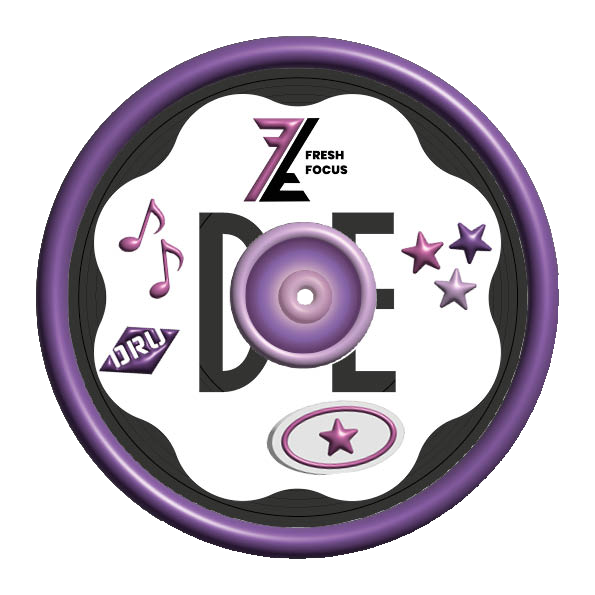
As an additional promotional item, I designed and created a felt coaster in the shape of an LP record. For the design, I drew inspiration from the Y2K style once again. I wanted it to match the rest of the rest of the designs. I wanted it to be playful, eye-catching, and nostalgic looking. I added various stickers to the coaster that fit this style, such as colorful graphics, shiny details, and iconic Y2K elements like balloon like stars. The combination of the LP shape and the stickers creates a design that aligns with the theme of music while evoking the atmosphere of the 2000s. The coaster is not only functional but also serves as a creative and visual complement to the rest of the work.

Douwe Egberts promo video

This video, I made as a promotional video for the collaboration of ‘Fresh Focus’ and Douwe Egberts. The video is filmed in a cozy café to give the audience a welcoming feeling. The video follows a young boy, who’s writing lyrics, when he sees the girl of his dreams. In the video, I wanted to portray that you should always take every chance you get, because it might be the last time you get one. The first quote says ‘Time doesn’t wait… So why would you?”

The second shoot

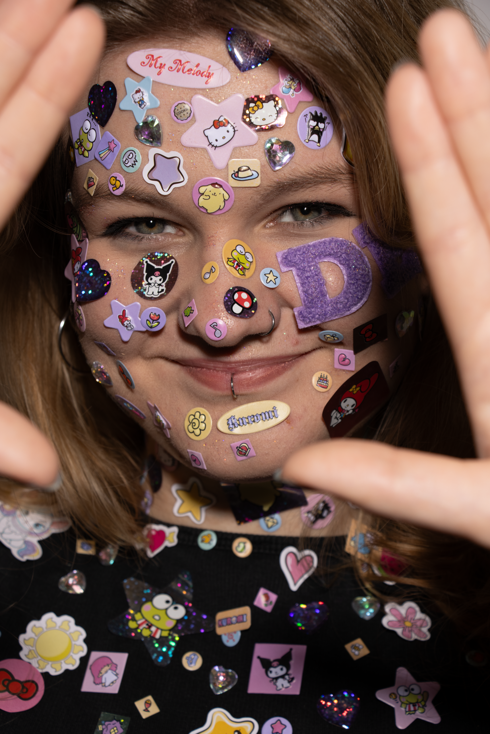
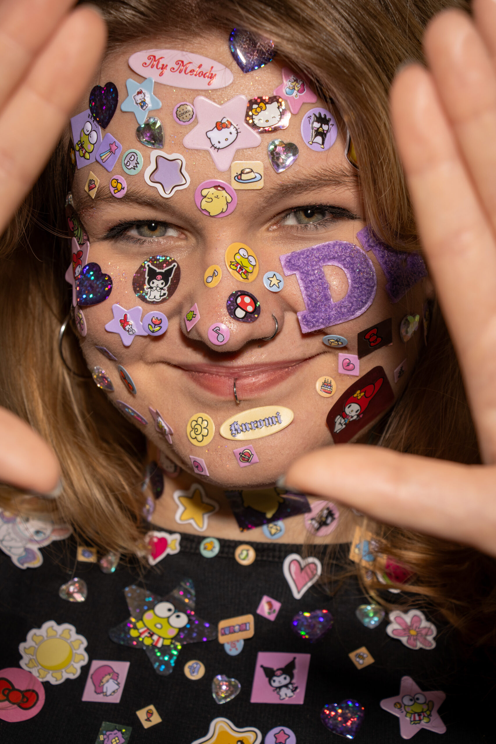
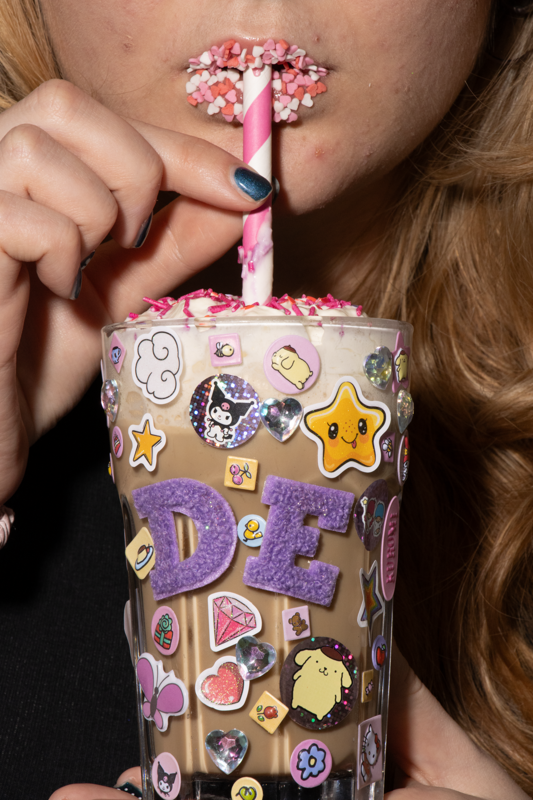
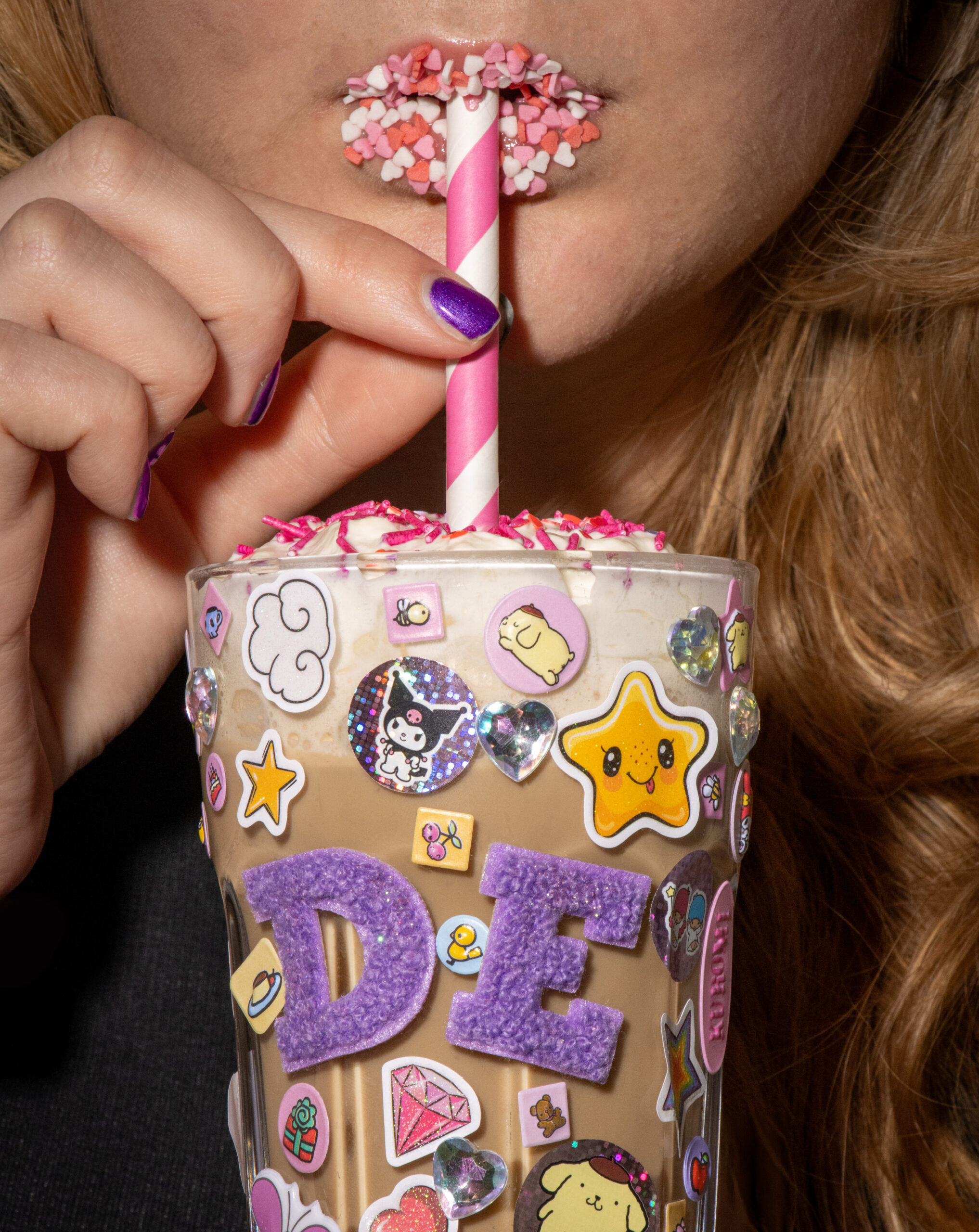
Together, these two photos form a powerful visual that is interconnected both technically and thematically. Both images were taken using a flash setup in which the flash serves as the dominant light source, as evidenced by the sharp details, high contrast, and distinct reflections on the stickers, glitter, and other shiny surfaces. The background is deliberately kept dark, drawing all attention to the girl. The first photo shows the bigger picture: a portrait of the person, who is completely adorned with the same stickers and decorative elements found on the glass. Using the same lighting, colors, and visual language creates a clear visual cohesion. In the second photo, the focus is on a close-up of the mouth and the richly decorated cup, with the flash further emphasizing the textures of the sprinkles, stickers, and straw. The first photo provides context and reveals the full concept, while the second photo focuses on a specific detail and sets the mood. Together, the photos tell a single story.

IMG_21202IMV3VS_ISA KERSTHOLT_FOTO 2
IMG_2120 22IMV3VS_ISA KERSTHOLT_FOTO 1

Internship

About my internship

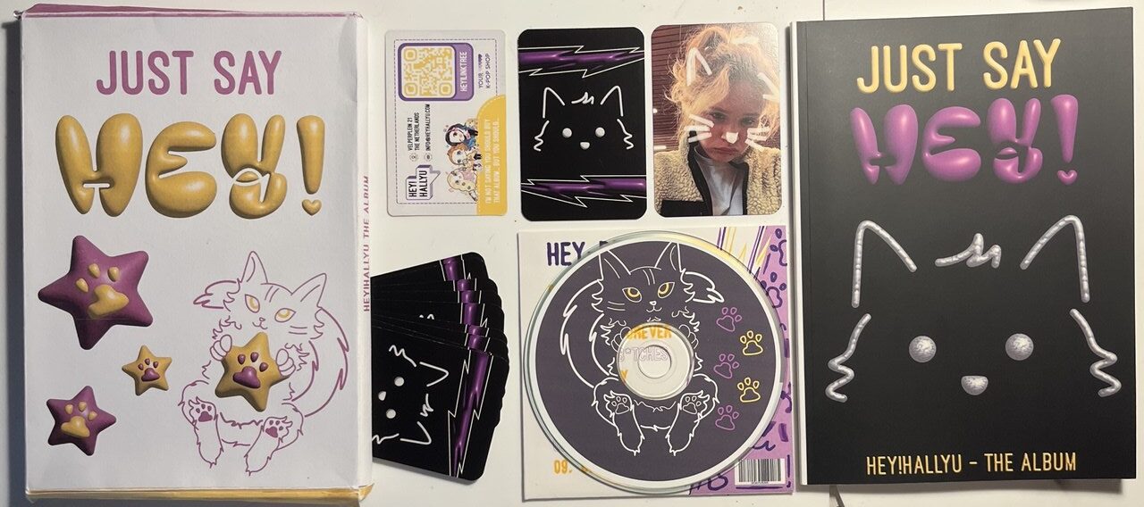
For my internship at Hey!Hallyu, a K-pop store in Arnhem, I created a complete music album as my final project. Instead of a traditional report, I wanted to do something creative and unique that reflected the brand. The album is entirely themed around the company’s mascot, a cat. The project includes several components: a report, photo cards (front and back), a working CD with a printed vinyl design, a CD cover and a cover that ties everything together. All elements form a visually consistent package. I used Adobe Photoshop, Illustrator, and InDesign to bring this project to life. It was more work than I initially expected, but the result is the project I am most proud of. In the report, i used QR codes leading to videos and photos, to make it more interactive, and fun to read through!

Photobook & Cover

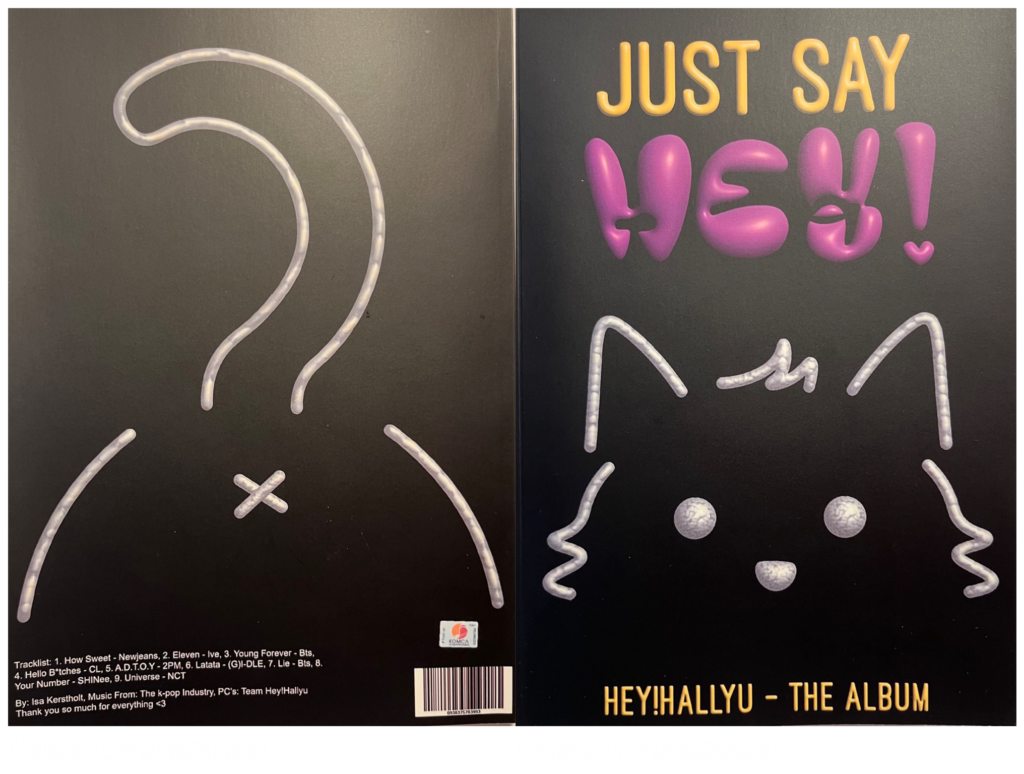
For my photo book, shown in the top of the two images, I chose a cat-themed design to match the company’s mascot. Using metallic effects and the company’s purple-and-yellow color scheme, I created a simple yet striking visual. The front cover represents the alignment of a cat, while the back humorously shows its backside — simple and playful. I also added barcodes and credits to give it a more realistic look.

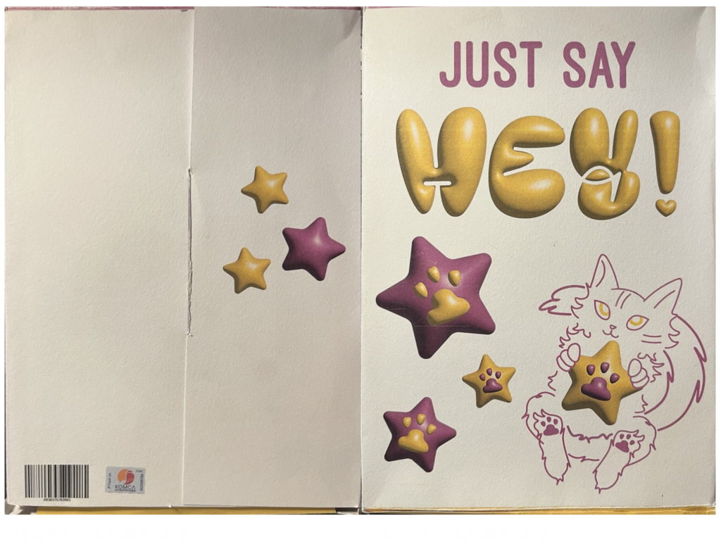
For the cover of the photo book (shown in the bottom image), I opted for a white background to create a nice contrast with the black photo book. I incorporated the cat, the purple and yellow colors, and the inflated elements from the main design. The cover was designed to be foldable, so it could be unfolded and then neatly folded back together.

CD & Photocards

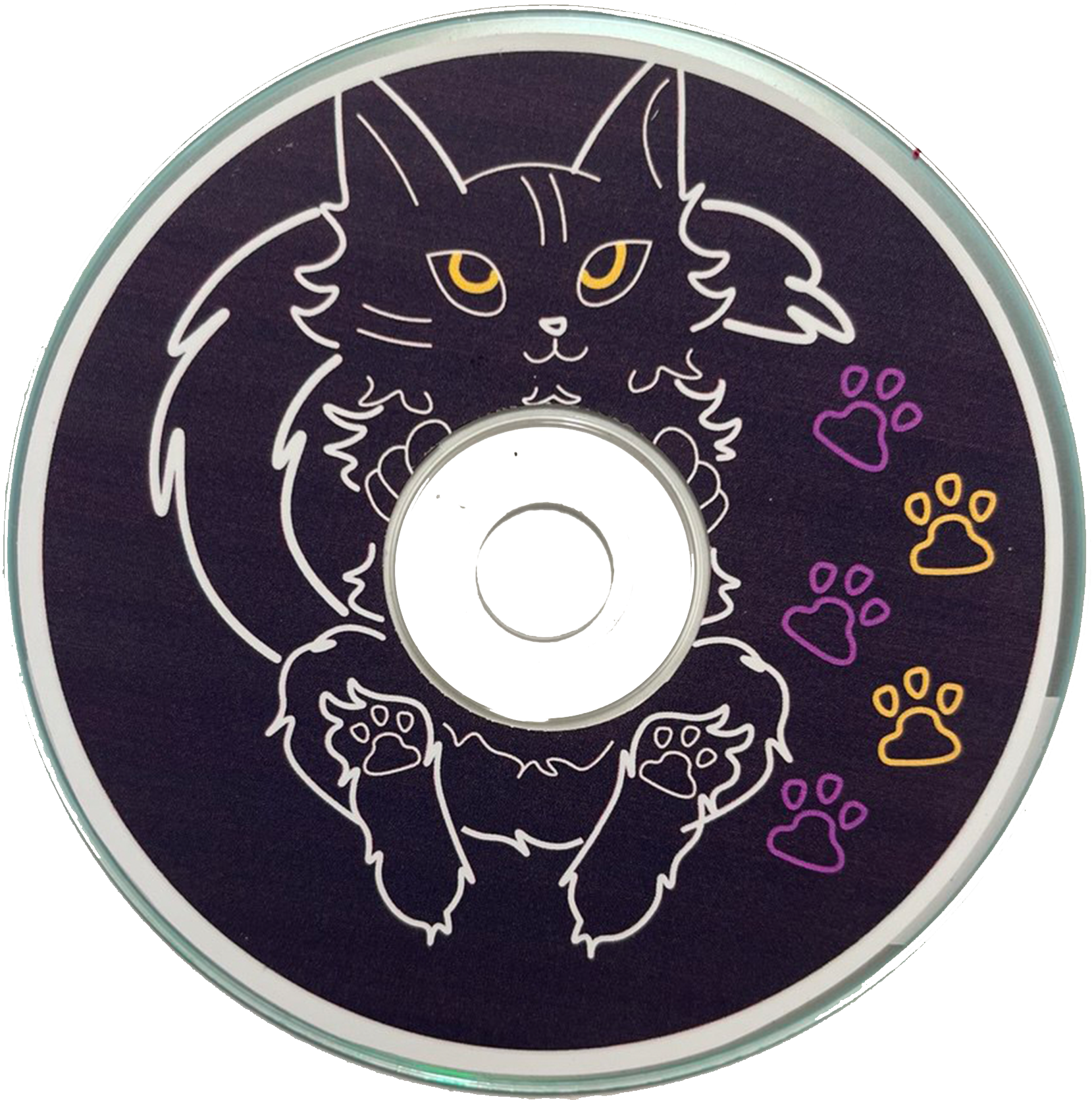
I personally burned and pressed a CD, with vinyl, featuring a cat as the central image. The design has a black background, uses purple and yellow (the company colors), and relies mostly on lines with minimal fill, giving it a sleek, graphic, and striking look. I also created photo cards with rounded corners. The back is black, featuring a metallic, aligned cat with purple accents and thunderbolts, while the front displays a photo of a team member from the company. look at them below here in the full picture!